This project delivers an interactive data dashboard that visualizes software engineering job postings in the United States in 2024. It consolidates key insights into a single, easy-to-use interface so users can quickly explore the market and understand compensation trends.
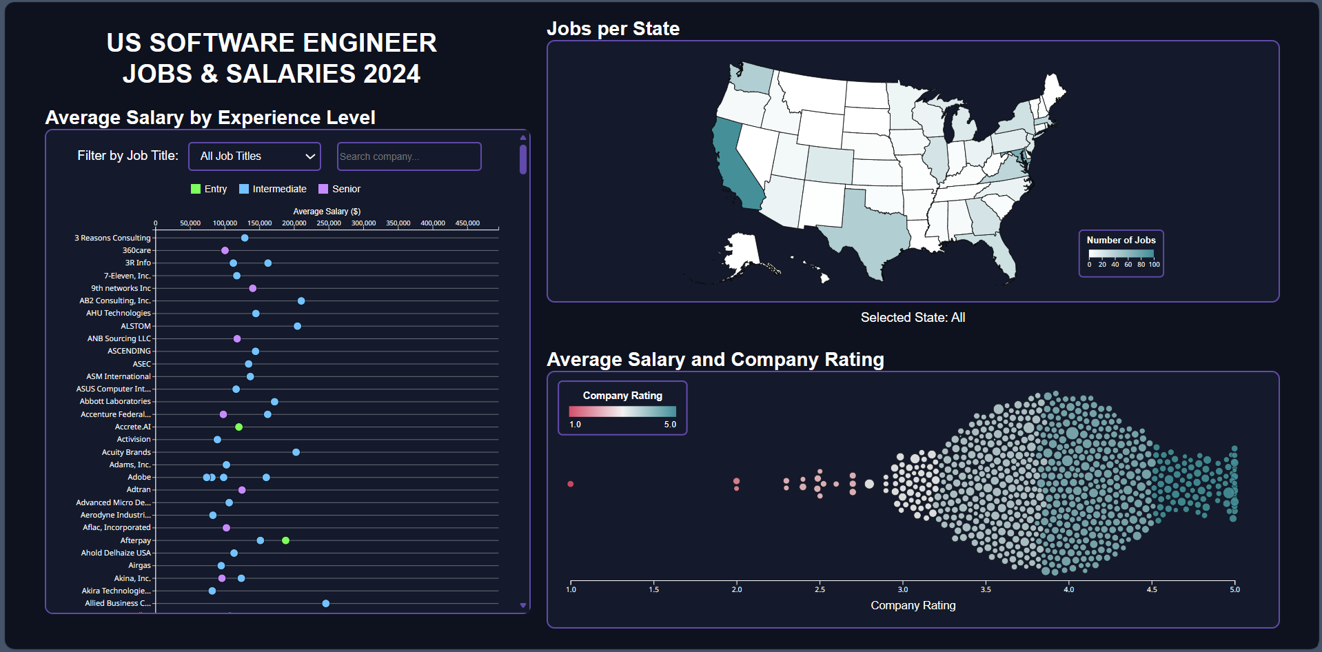 Figure 1: Dashboard overview
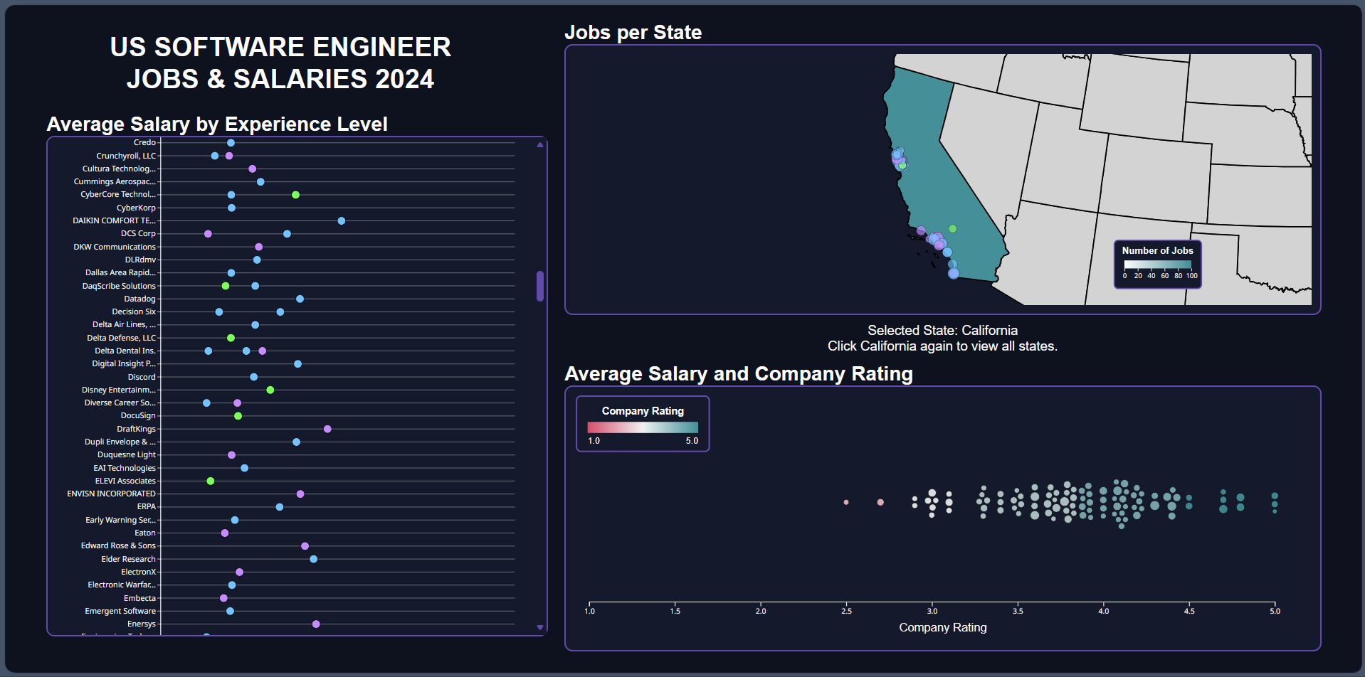 Figure 2: State-level map view
Highlights of the dashboard:
- Scatter plot: experience-salary analysis across companies with adjustable axes and a drop-down filter.
- Bubble chart: interactive bubble chart where each bubble represents a company with its rating.
- Geographic distribution map: a two-level (nation/state) map of the United States, featuring its user-friendly interactive plays and smooth animation.
- Bidirectional filtering: selecting a state in the map filters the bubble chart to display only companies in that state, and clicking a company bubble triggers a zoom animation to that company's state on the map.
- Tooltip on hover: detailed information about companies and job postings.
The positioning of United States cities on the map view relies on a local copy of the TopoJSON library (v3.0.2). The geographic data, including the latitudes and longitudes of United States cities used in this project, depends on a publicly accessible dataset built from the U.S. Census Bureau.
Click here to view the live dashboard. You may need to adjust your browser zoom level for the best experience.
View this project on GitHub ![]() .
.
Technologies: CSS • D3.js • HTML • JavaScript • TopoJSON